Archive for October, 2011

White Space: Friend or Foe?

White space is a very controversial thing in the design world.  As for me, I think it is beautiful.  Thats right, white is beautiful.  I’m sure many designers disagree with me, and I used to be just like them.  When I was first starting out as a designer I felt like the more color, the better.  I could not disagree more now.  There are certain instances that white space isn’t necessary, depending on the design, but for the most part, it’s helpful.  I see a lot of designs that are just too busy, people think that every inch of free space needs to be filled with color or words.  For example..

There is so much going on in this one design your eyes don’t know what to focus on.  It’s obviously a poster that has a lot of information but  you can hardly focus on the words, which in this case is the most important part.  It is also important to note that white space doesn’t necessarily have to be white.  It can be any color really, but a solid background making it easier for the eyes to focus on one specific graphic, or sentence.  Such as….

It just makes sense that this is on a solid background because of the content.  While researching white space I came across a blog that I thought did a good job of explaining it.  Click here 🙂 to see it!

White space is also used to show contrast.  This also makes a design much more appealing to the eye and allows the viewer to concentrate on one thing, probably the most important thing.

This solid white background makes this design so pretty.  It’s obviously what the purpose is and there’s no need to busy-up the design with colors and words that are totally unnecessary. Less is more 🙂

Well I’d like to know other peoples opinions, I mean, I know I’m right all the time but I’m sure there’s someone who thinks that white space is boring… let’s hear it.  I look forward to chatting with you all next week for Illustrator vs. Indesign. 🙂

My Color Theory

Deciding what color to use in your design is one of the biggest questions as a designer.  All colors have meanings.  I am a semi-expert on this subject due to a vigorous senior research class I had to take to graduate college.  We all had to pick an aspect of mass media we found interesting.  I chose color, particularly color in advertising.  While researching color I found tons of interesting things that I didn’t know about color, such as each color having a specific meaning.  Knowing what colors mean is vital in design if you want people to actually look at your design and develop feelings about it.  Here is the list I came up with during my research about what colors mean.

Red: strong emotions, blood, love, strength, danger, energy; represents sports, cars, energy drinks, food & drink and restaurants, stimulates appetite

Orange: demands attention, energy, enthusiasm, vibrant, balance

Yellow: joy, happiness, optimism, laid-back, perky, cheerful, illness, hazard; represents food & drink and restaurants, stimulates appetite

Green: nature, environment, good luck, jealousy, envy; represents organic, nature, eco-friendly

Blue:  life, purity, peace, calm, loyalty, water, sky, cold; represents cleanliness, water, suppresses appetite

Purple: royalty, spirituality, wisdom, mysterious, arrogance; represents children

Black: “cheerless occasions,” night, evil, mourning, elegance, anger, power

White: purity, sacred, angels, cleanliness, winter, simplicity, youth; represents hospitals, cold, low-fat and dairy items

Pink: sweet, innocent, romantic, charming, love, childish, good health

Source: http://www.archimediastudios.com

For another good source of color meanings click here! 🙂

Now how will researching colors help make a design better?  Well, if you are doing a design for a specific group of people or company you need to chose a color that relates to what you are trying to accomplish.  For example, if you are doing a design for going green it just makes sense to use green, or brown, because you now know that it is used to represent nature and things eco-friendly.  Also, you now know that the colors red and yellow are proven to stimulate your appetite, so if you are doing a design about food you should use red or yellow because your design will make people hungry and want to go out and get your product.

These are examples of different fast food restaurant logos, when you see them together you can really notice they all have similar color schemes.  They are all using mainly red and  yellow and some orange because of the above reasons.

Source


Aside with knowing what colors mean and what colors to use in your design, its important to make it look pretty too! 🙂

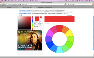
Going back to the elementary school art class days, the color wheel will save your life.  However, the basic color wheel has become a bit more advance over the years… this is a pretty awesome color wheel I found that shows you what colors go together best.

This is what the wheel looks like, click on it and pick a color and shade to see what colors look best together!

If you are using a design program like indesign or illustrator there are built in color groups that you can use to get ideas about what colors to use.  When you go to pick a color there will be another tab that says “Color Schemes” if you click on that it will automatically match your color will a scheme of other colors that will go great together if you can’t decide on one yourself.  It’s a great tool to help pick a color that works well and saves you the stress of picking a color from the overwhelming selection of colors you have to chose from.

Thanks for reading again! Stay tuned in next week my devoted bloggers, for ‘White Space: Friend or Foe’.